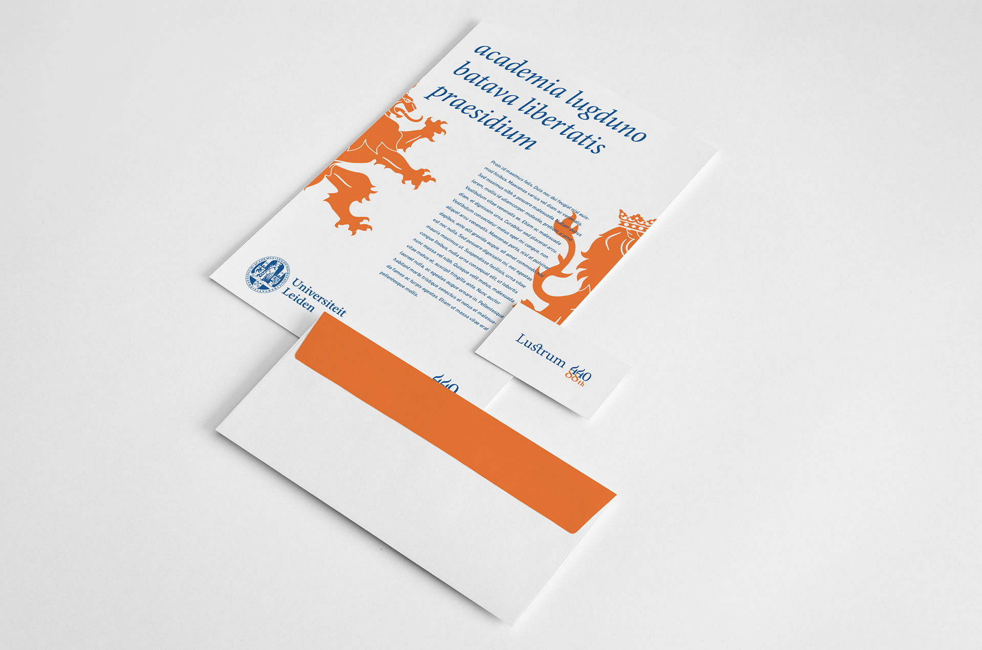
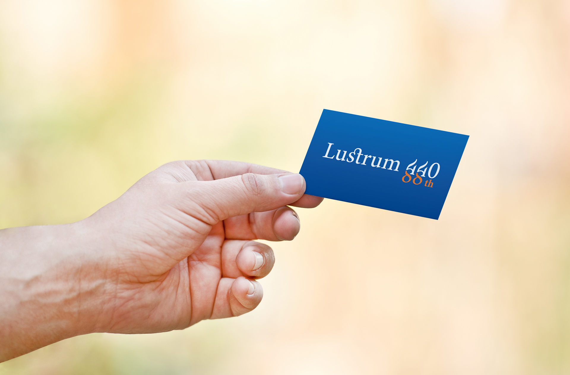
The Process of the Lustrum 440/88 Logo
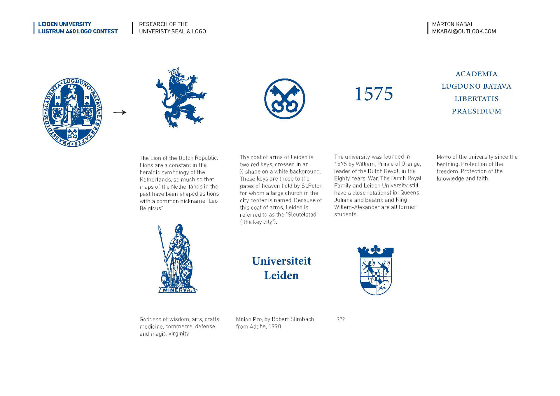
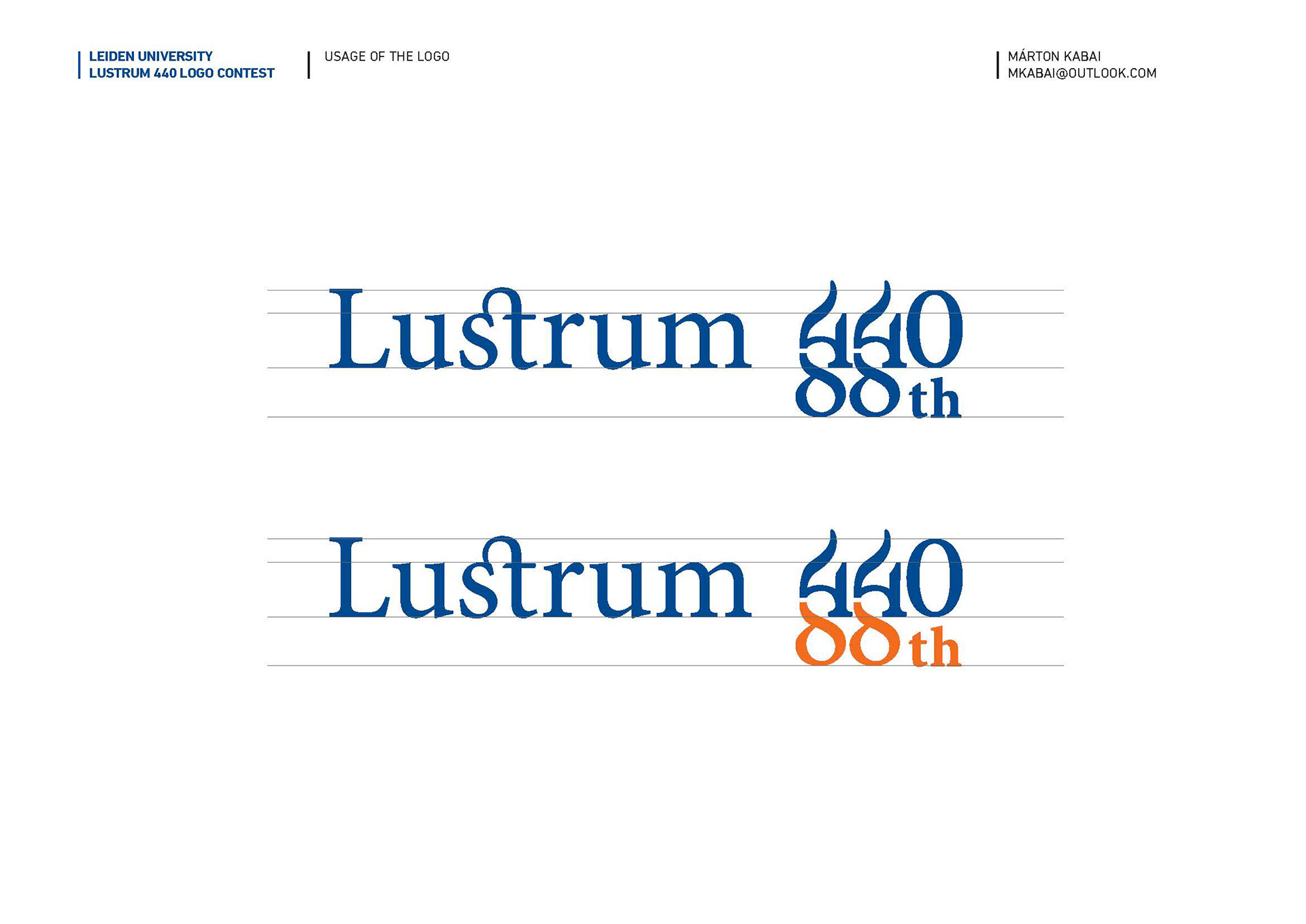
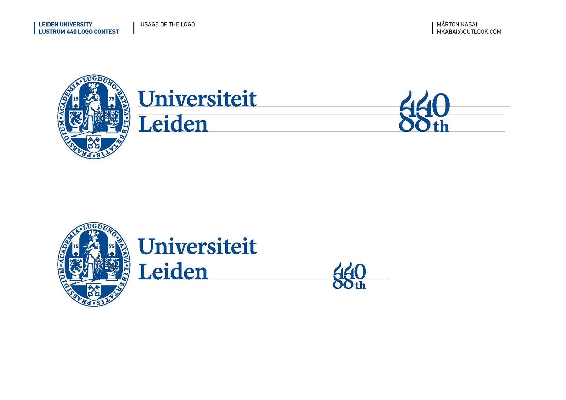
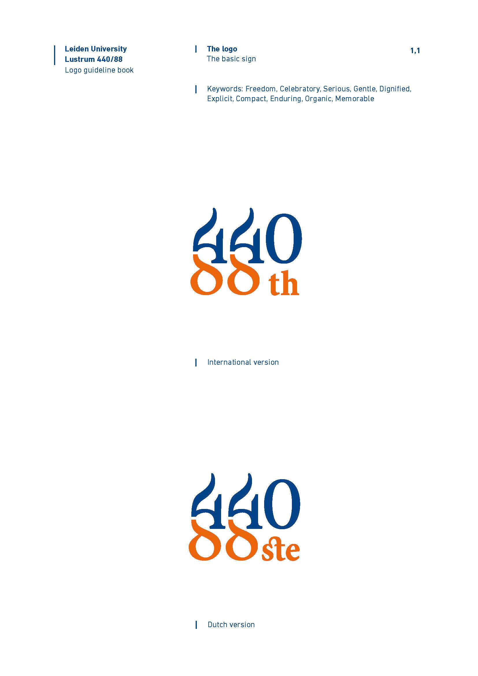
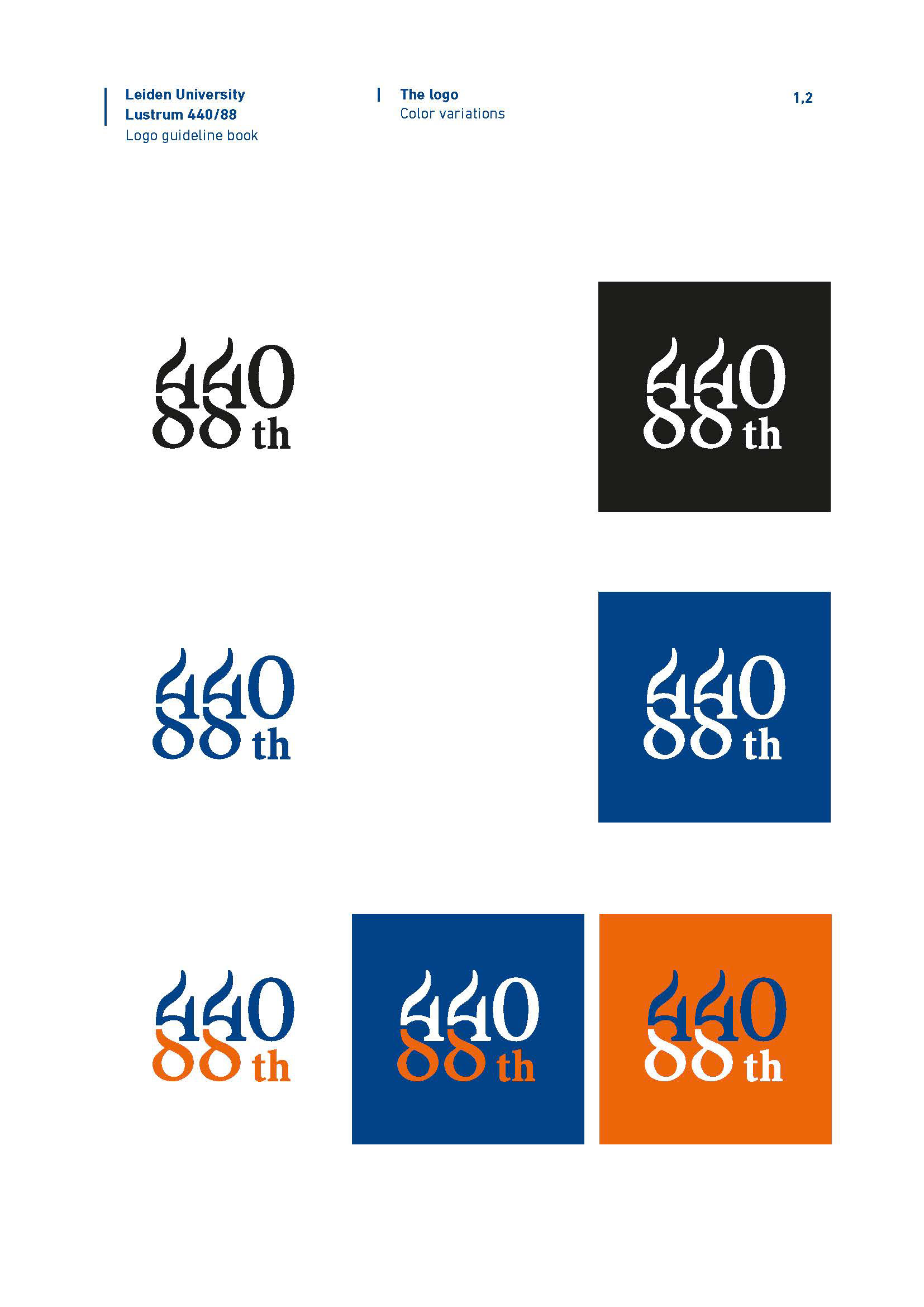
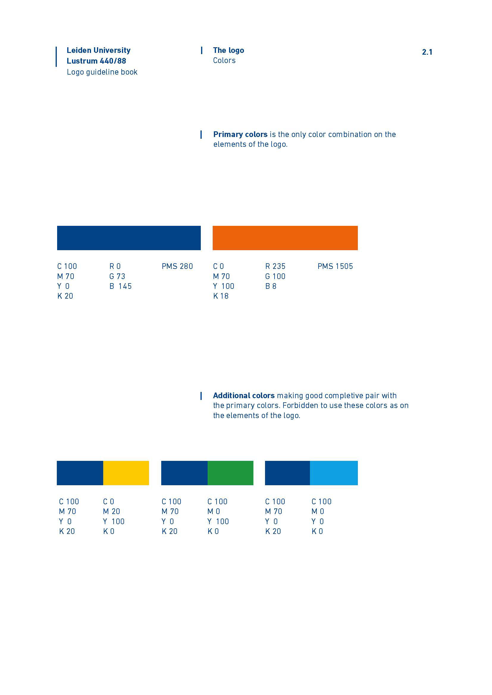
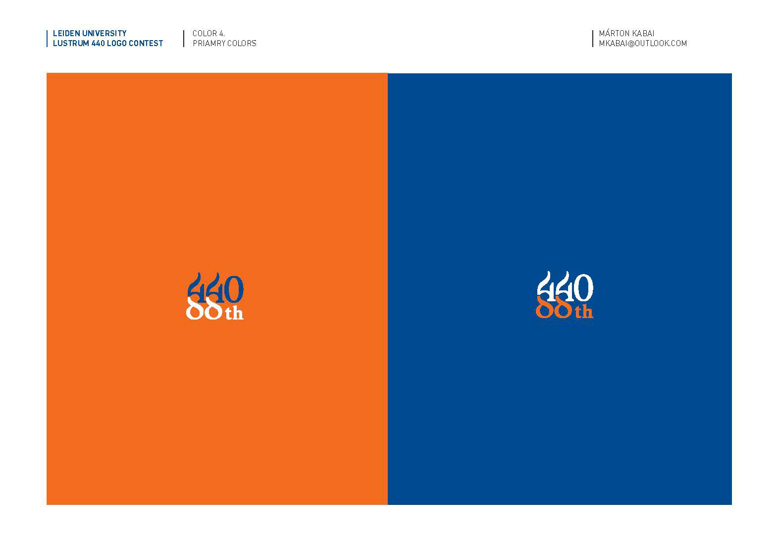
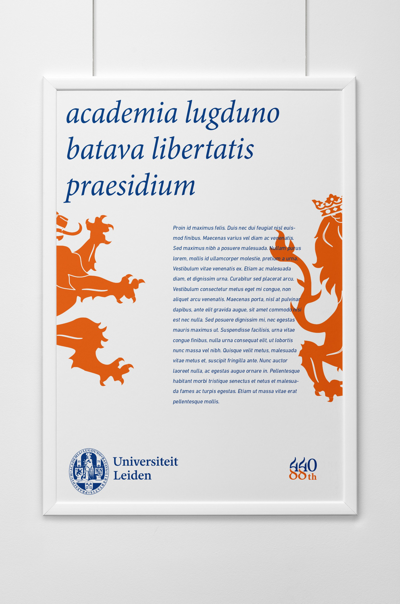
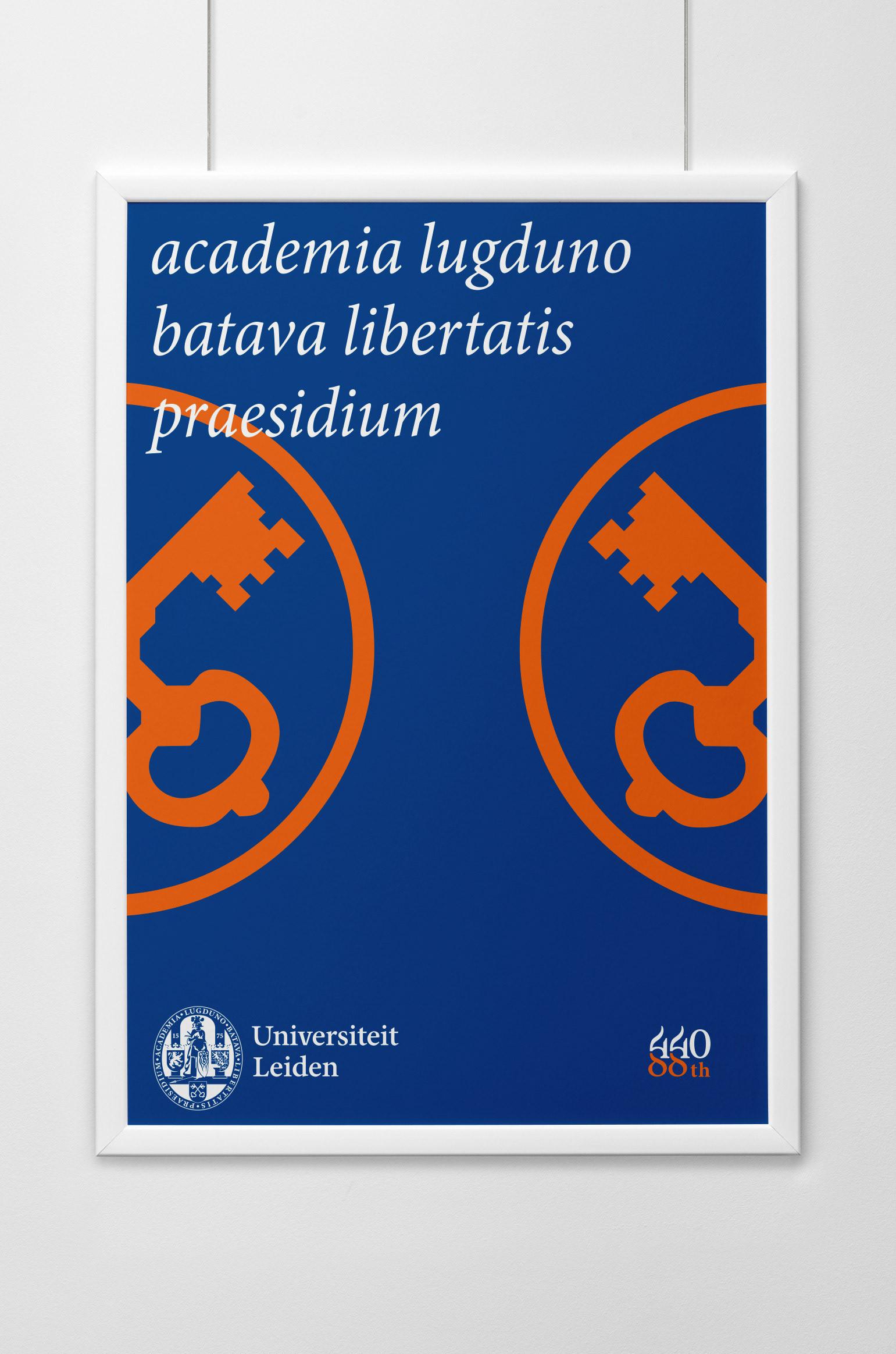
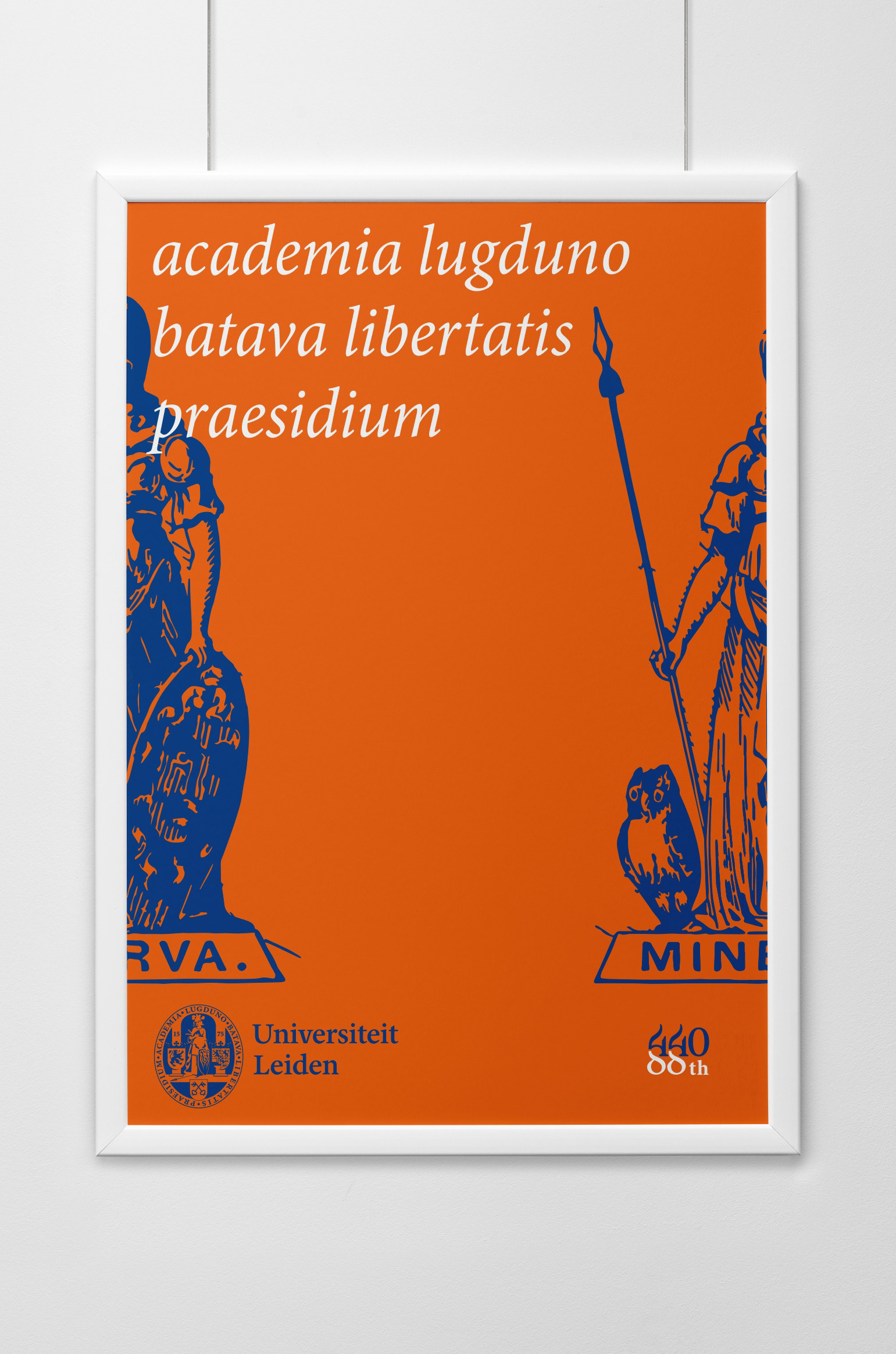
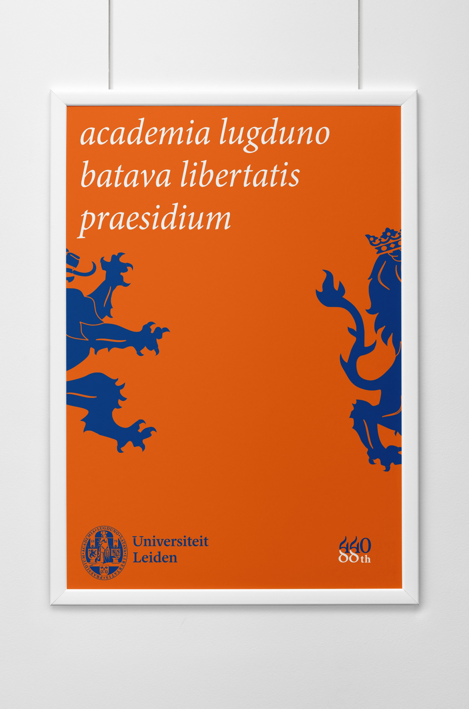
I started my design process with a research of Leiden University history. I found the University seal very important as the part of the identity, so I made some analysis in order to find the Minion typeface as a baseline. The second part was to combine the 440 and the 88 only using the Minion typeface. I made several sketches due to find the most natural and elegant combination of this two numbers. Regarding the colours, I've chosen a complementary deep orange for the specific deep blue that made the logo more festive.


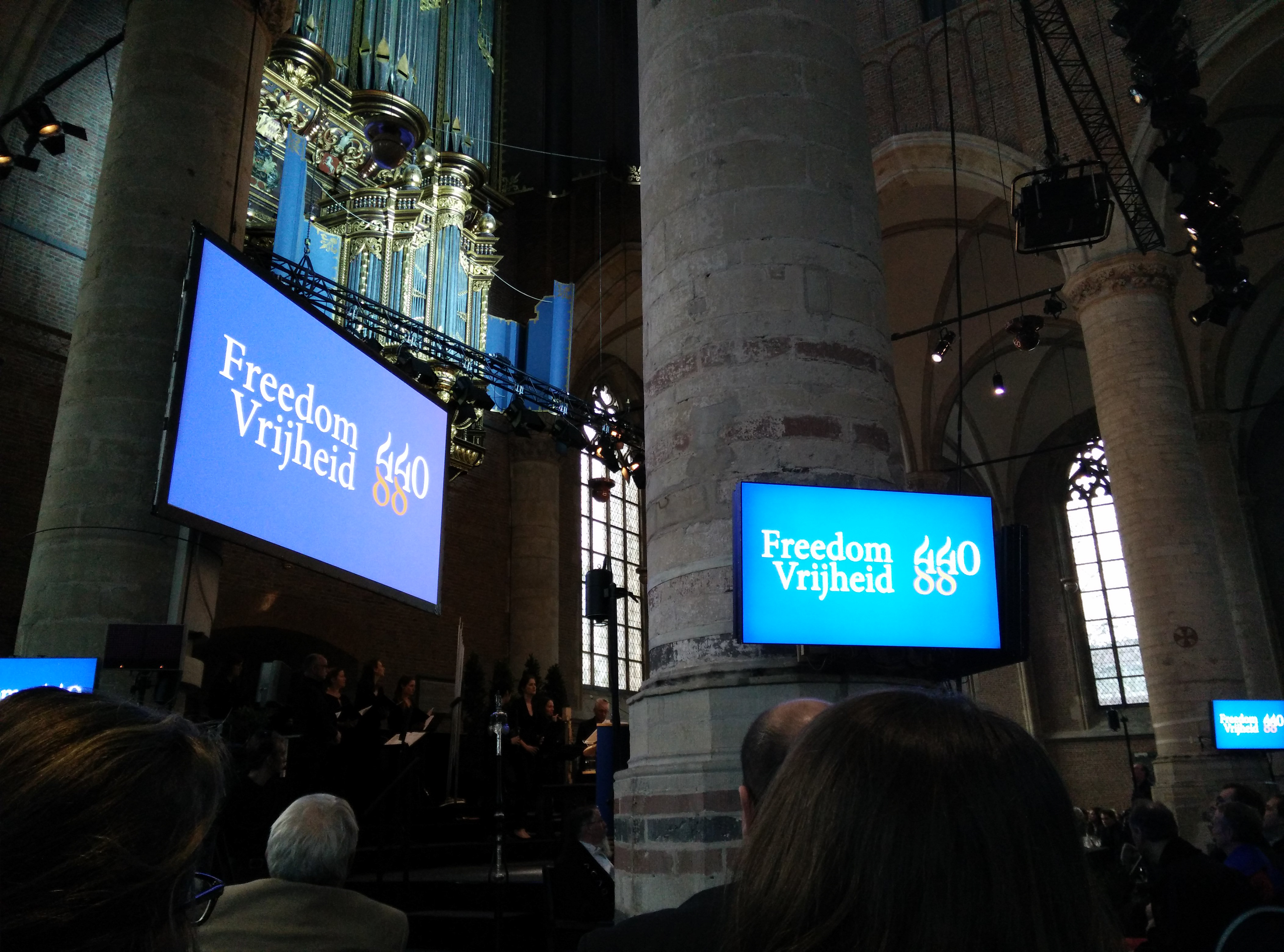
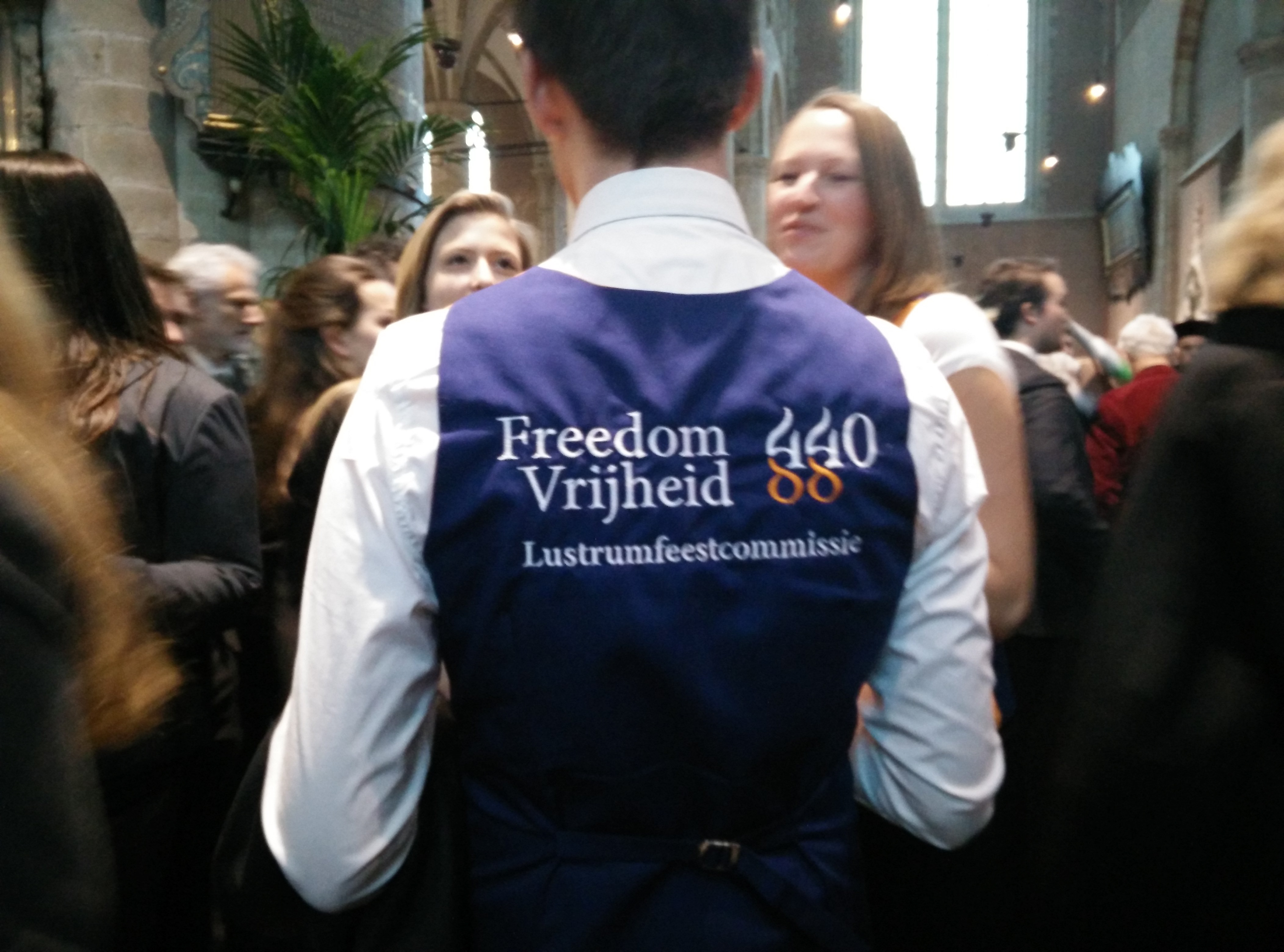
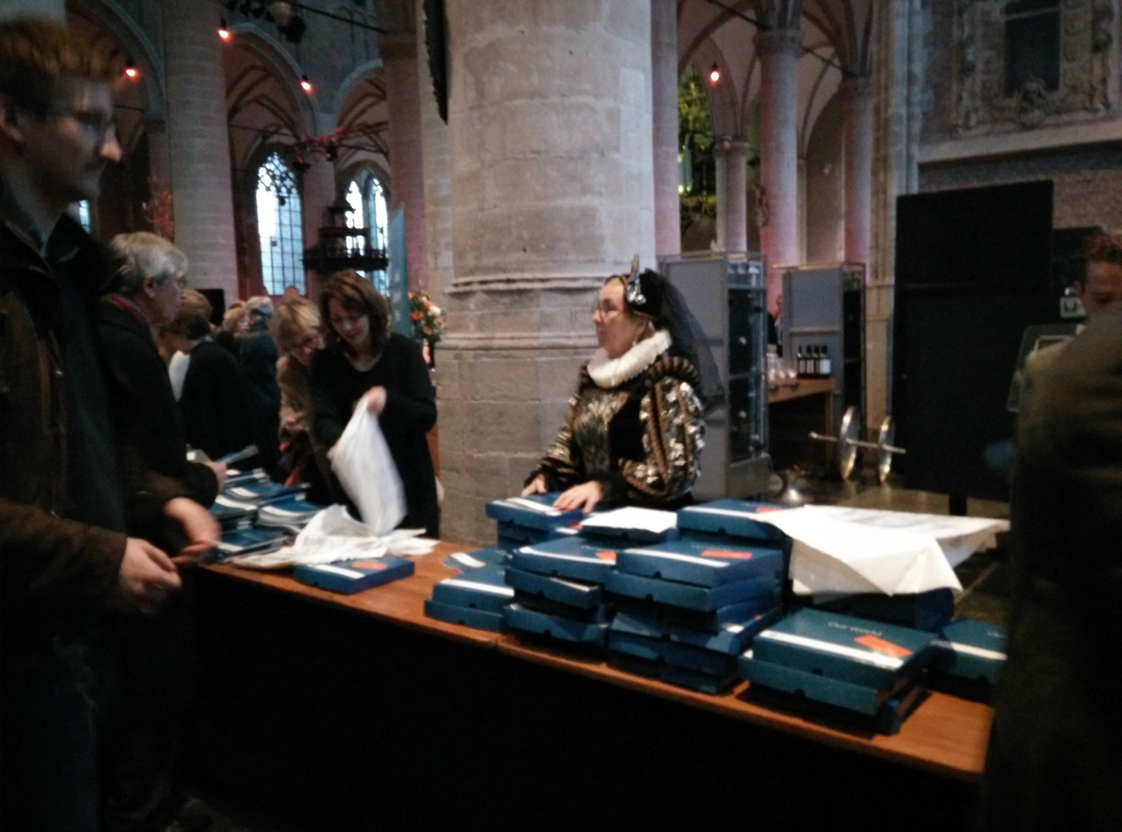
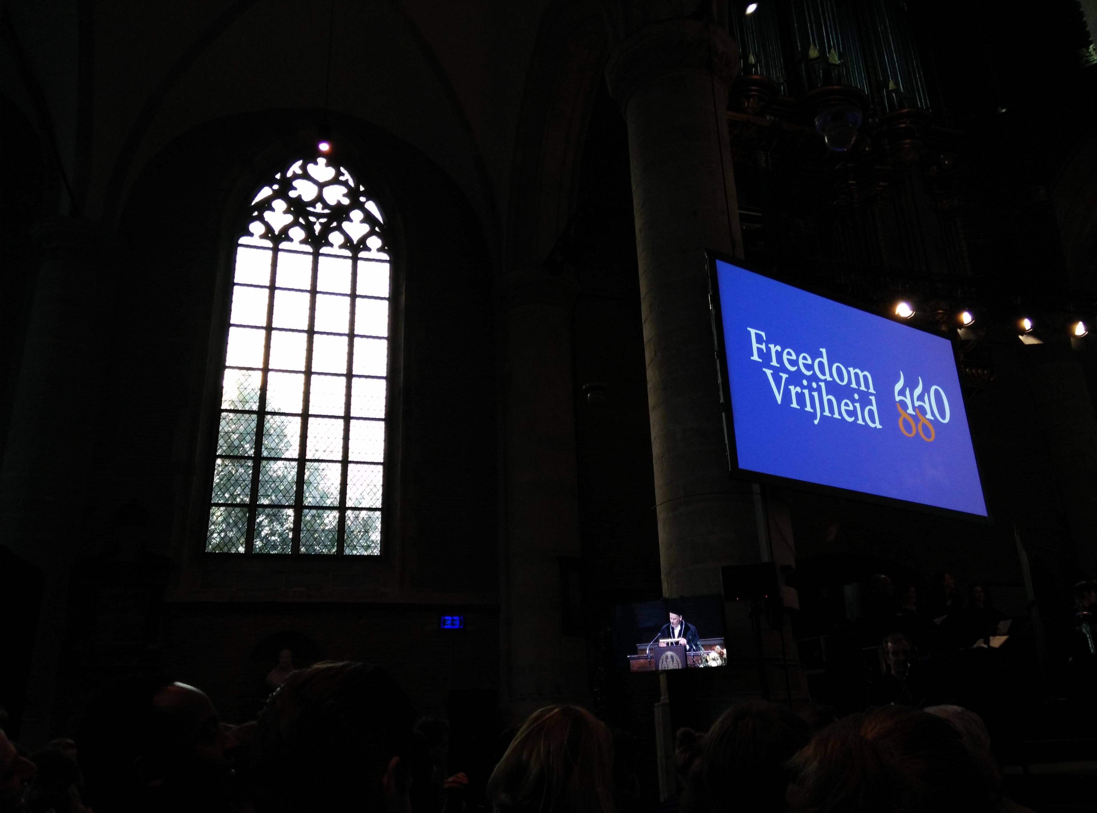
The Ceremony
Thanks to my only wife!
&
Thanks for watching!